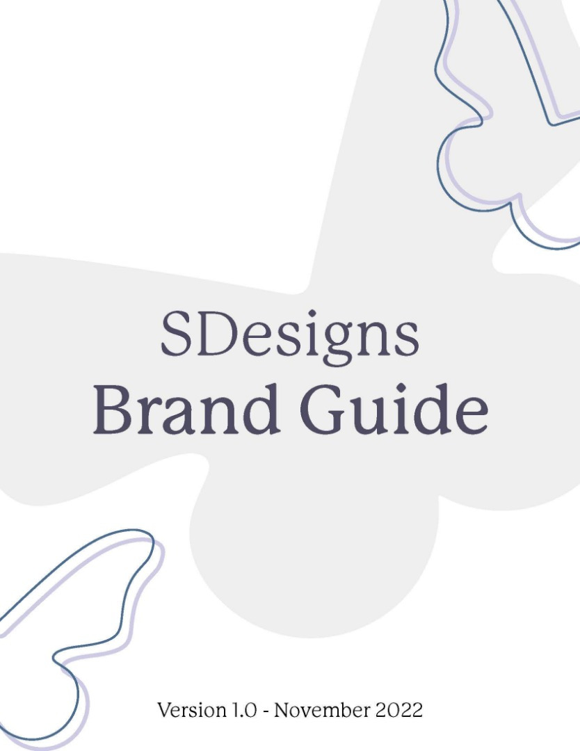
Graphic Design | SDesigns Brand Guide.
This project asked us to create a personal logo along with a brand guide. Within the brand guide, it contained an table of contents, logo examples, clear space and logo misuse, brand colours, typography and collateral such as stationary.
PROCESS
The logo I designed was inspired around my family and memories. I wanted it to feel personal and to put it simply, me. No matter which part of the logo you look at, there's something unique about it. From the colours going back to the colour split my wall was painted when I was younger, to the butterfly that's my nickname in Portuguese, or simply put, my initials peeking through the design.
As far as typography goes, I wanted something simple and classy to not overshadow the brand and website as a whole. As a serif font, it leads to be traditional, and reliable. Both are things I strive to be and stick to within my designs and lifestyle. It also helped bring in an additional touch of a more personal setting.
Finally, as I described a little bit in the logo, the main colours were chosen based on my childhood and favourite colours. I've always been fond of purple and blue, but the colour meanings go deeper than that. Blue (#4D6C93) stands for dependability, integrity, trust, stability, and loyalty. All important backbones as a brand and a person. Purple (#CCCCF5) signifies creativity and passion; aspects I can't think of going through life without. Together, I believe those colours meld to show a bit of insight into the person that I am and hope to bring into my work and brand. As for the other two, the crème or off-white colour (#EFEFEF) is for simplicity, a style choice I lean towards in my creations and preferences and the purply-blue (#4C4B63) was to help bridge the gap by replacing black and adding depth to the entirety of the brand.
Finally, with the stationary I wanted to bring simple elements of my logo into the composition. Using the butterfly outlines to bring in recognition with my brand into the stationary without splattering my logo over everything. This allowed for room to play with the symbol to create interesting displays for the business card and the ribbom at the bottom of the envelope.
Software & Tools Used:
Adobe Illustrator, Adobe Photoshop
Year:
October -
November 2022


This project asked us to create a personal logo along with a brand guide. Within the brand guide, it contained an table of contents, logo examples, clear space and logo misuse, brand colours, typography and collateral such as stationary.
PROCESS
The logo I designed was inspired by my family and memories. I wanted it to feel personal and to put it simply, me. No matter which part of the logo you look at, there's something unique about it. From the colours going back to the colour split my wall was painted when I was younger, to the butterfly that's my nickname in Portuguese, or simply put, my initials peeking through the design.
As far as typography goes, I wanted something simple and classy to not overshadow the brand and website as a whole. As a serif font, it leads to being traditional, and reliable. Both are things I strive to be and stick to within my designs and lifestyle. It also helped bring in an additional touch of a more personal setting.
Finally, as I described a little bit in the logo, the main colours were chosen based on my childhood and favourite colours. I've always been fond of purple and blue, but the colour meanings go deeper than that. Blue (#4D6C93) stands for dependability, integrity, trust, stability, and loyalty. All important backbones as a brand and a person. Purple (#CCCCF5) signifies creativity and passion; aspects I can't think of going through life without. Together, I believe those colours meld to show a bit of insight into the person that I am and hope to bring into my work and brand. As for the other two, the crème or off-white colour (#EFEFEF) is for simplicity, a style choice I lean towards in my creations and preferences and the purply blue (#4C4B63) was to help bridge the gap by replacing black and adding depth to the entirety of the brand.
Finally, with the stationary, I wanted to bring simple elements of my logo into the composition. Using the butterfly outlines to bring recognition of my brand into the stationary without splattering my logo over everything. This allowed for room to play with the symbol to create interesting displays for the business card and the ribbon at the bottom of the envelope.
Software & Tools Used:
Adobe Illustrator,
Adobe Photoshop
Year:
October -
November 2022


