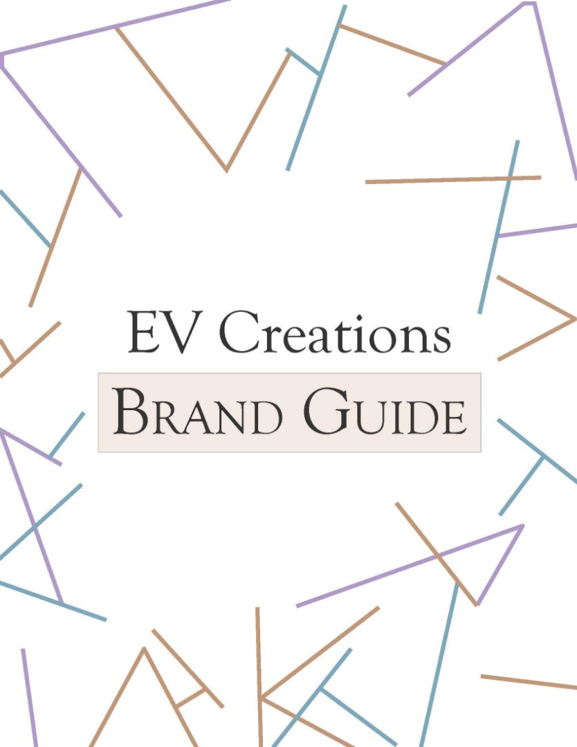
Graphic Design | EV Creations Brand Guide.


This brand guide centered around a logo created for a faux company corporate identity system. It included a black and white version of the logo, as well as horizontal and stacked versions. Following after it showed the size and spacing, brand colours, font choices, the buisness cards abd mockups and finally the thumbnails sketches and process work.
PROCESS
The logo I designed was inspired by the contents of the company I wanted to create. Their merchandise would be craft-oriented containing cross-stitch items, crochet and painted items. This is where I took the main inspiration from, taking elements from the crafted items such as the materials used, and the tools of the trade to create a pleasant layout showing off the brand and merchandise.
As far as typography goes, I wanted something creative and stylistic to stick with the brand, but still have it be easily readable. As a cursive font, it leads to be unique and shows creative qualities like the brand/company itself. Both are qualities EV Creations strive to show and stick to.
The colours were chosen based on the brand itself and what they mean. Choosing light and more vibrant colours lead to imbue the creative approach and qualities they have. While the lighter tan colours kept the realistic touch of the paint brushes and helped ground the overall colour scheme with the addition of black and white. In addition, blue stands for dependability, integrity, and loyalty. Good qualities for a brand to have while purple signifies creativity and passion; the very backbone of the brand. Together, I believe those colours meld to show a bit of insight into the person that I am and hope to bring into my work and brand.
Software & Tools Used:
Adobe Illustrator
Year:
October 2021


